Widget editor
To configure the widget press the gear icon in the right top corner of the widget. The Widget Editor will appear.
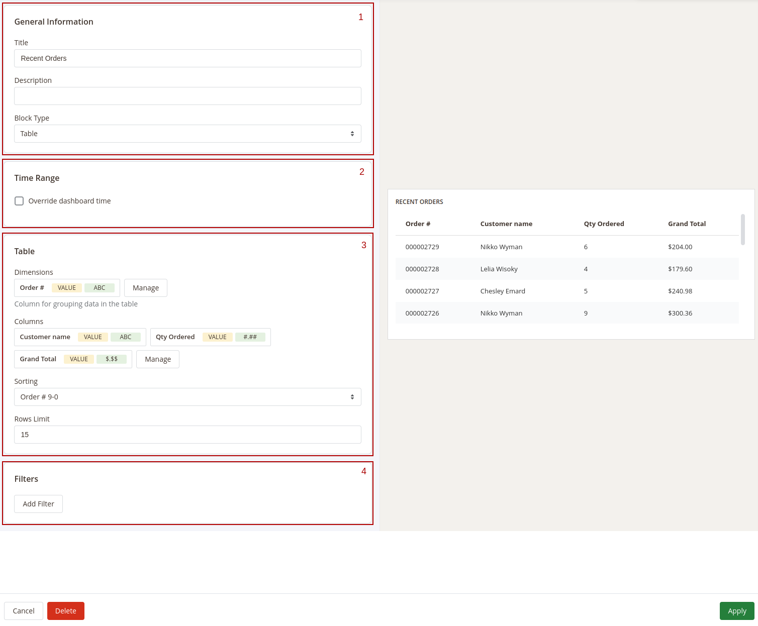
The Widget Editor has 2 sections - Widget Settings to configure the widget and Preview to check how the data in the widget will be displayed before saving the widget. The Widget Settings section has the following inner sections:
1. General information
Main configurations of the widget. This section has the following settings:
- Title: the name of the widget
- Description: widget's description
- Type: defines how the data in the widget should be displayed.
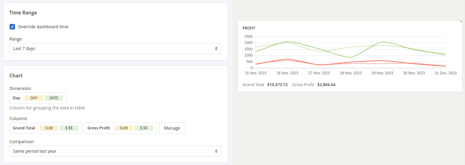
2. Time Range
Date filter settings for the widget. This section has only one setting - Override dashboard time. When this setting is enabled the widget will use its own date range to filter the data. You'll be able to choose one of predefined date ranges from the Range dropdown.
3. Widget's content settings
This section depends on the Type of the widget and has different setting options correspondingly:
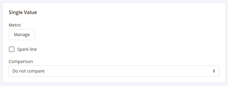
Single Value
Shows the single value in the widget
This type has 3 settings:
- Metric: choose the column for which the data in the widget should be displayed
- Spark Line: show/hide the sparkline representing changes of the value from the column selected in the Metric setting during the time range applicable for current widget
- Comparison: choose the period for which the widget should display the value for the same metric to compare it with the current value
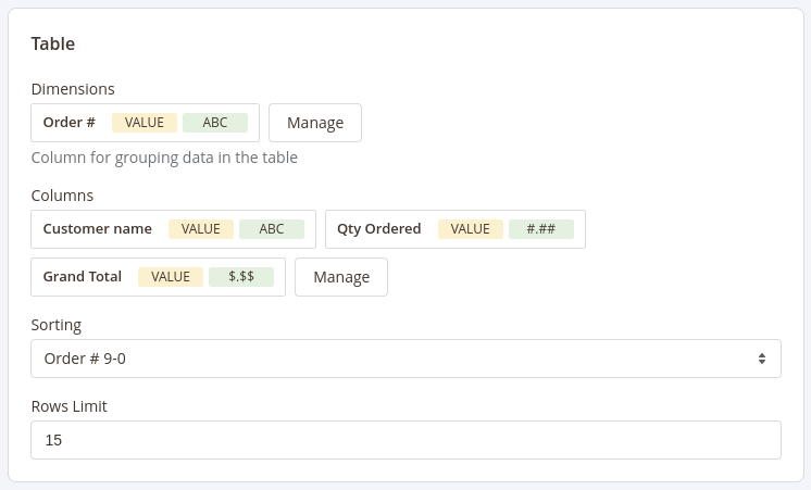
Table
Displays the table with values according to the configurations (similar to how the reports are displayed)
This type has 5 settings similar to settings in reports configurations:
- Base Table: set the base table for the table
- Dimensions: set the dimensions for the table
- Columns: select fields that should be displayed in the report
- Sorting: select the column for the report to be sorted by and the sorting direction. Options depend on the fields selected in the Dimensions and Columns settings
- Rows Limit: set the limit for the number of rows to be displayed in the table
Chart
Displays the data in the widget as a chart
This type has 3 settings:
- Dimension: defines the horizontal axe in the chart
- Columns: defines the fields data that should be used in the chart
- Comparison: defines the period in which the current data in the chart should be compared
HTML
Enables you to include any content on the dashboard
This type has has only one field to fill in - Content.

4. Filters
Configure fields and conditions by which the data in the widget should be filtered. Similar to the Filters settings in reports configurations.
After configuring the widget press the Apply button to apply the widget settings' changes.
After adding and configuring all widgets to the board press the Save Board button in the Toolbar and click the Customize button to exit the Configure mode.