Placeholders
This section displays all available placeholders that can be used to show banners in different areas of the website.
Placeholder — a designated area on a webpage where a banner can be displayed. Each placeholder can be assigned to one or multiple banners.
Placeholders list
Navigate to Marketing -> Promo Banners -> Placeholders to view the full list.
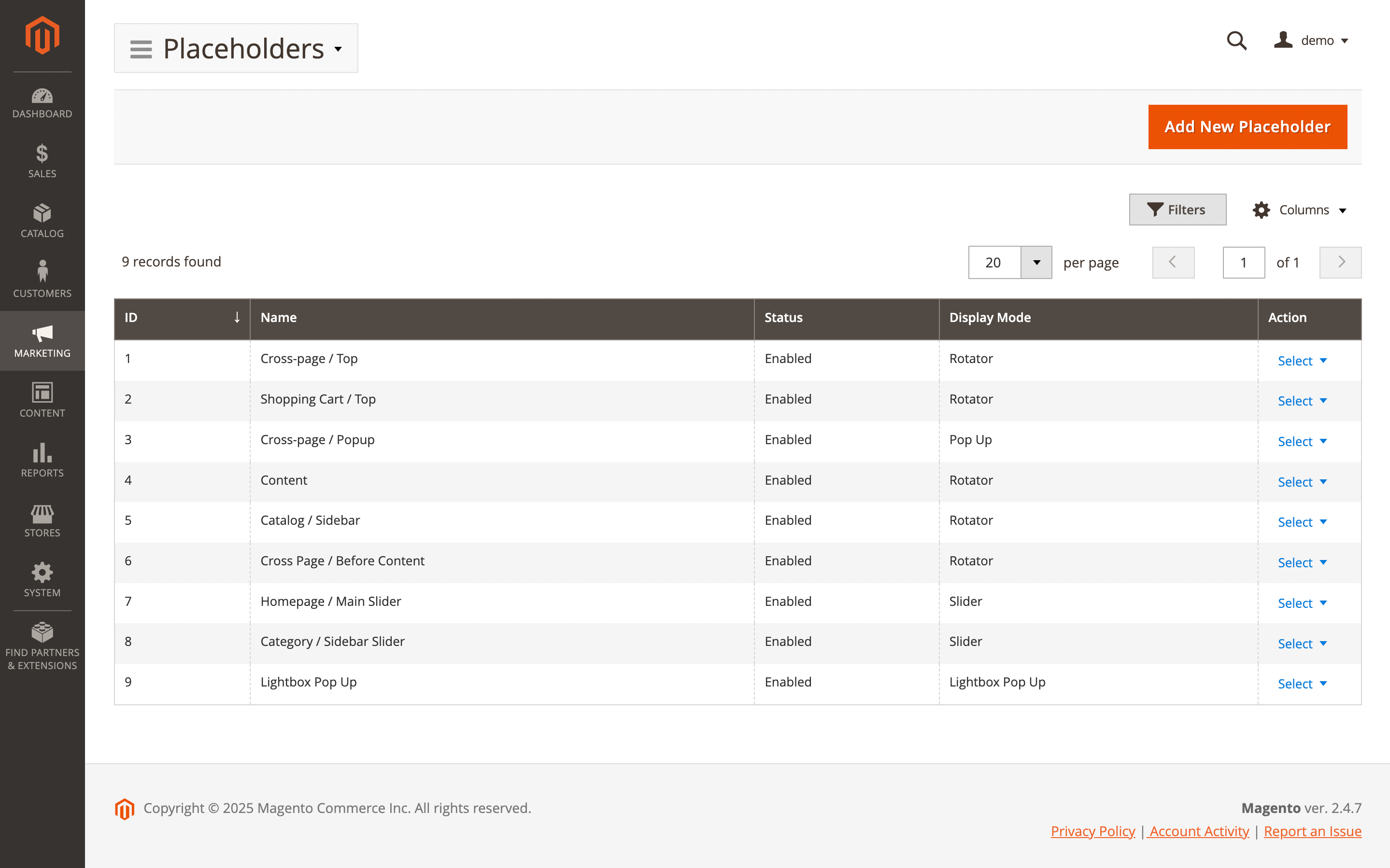
Here, you'll find the following fields:
- ID: the ID of the placeholder.
- Name: a unique placeholder name.
- Status: the current status of the placeholder.
- Enabled
- Disabled
- Display mode: show the selected banner display method on the frontend.
- Actions: available actions for the selected placeholder.
- Edit: allows you to modify the placeholder.
- Delete: removes the placeholder from the list.
Placeholder settings
Use the Edit option in the Action column to view details of a specific record. Next placeholder settings will be available:
General Information
- Is active: turn the placeholder on or off. If the placeholder is active, it will appear in the banner placeholder settings.
- Internal name: set a unique name for the placeholder.
- Display mode: choose how the banner will be displayed. Available options include:
- Rotator: randomly rotates the banner ads seen by users. Each time the page is loaded or refreshed, a different banner will appear.
- Pop-up: displays on top of the site content after page loading. Users can close the banner by clicking the Close button. Option-specific settings:
- Popup position: determines where the banner will appear:
- Bottom right (default)
- Bottom left
- Top right
- Top Left
- Delay (seconds): time in seconds after which the banner appears (default is
3seconds if left empty). - Re-appear in (hours): controls when the banner will show again after its first appearance. Leave the field empty to show the banner once every 24 hours:
- Any positive number: the banner will reappear after the specified number of hours.
- 0: the banner will appear on every page reload.
- -1: the banner will appear only once.
- Popup position: determines where the banner will appear:
- Lightbox Pop-up: similar to Pop-up but covers the entire page. Option-specific settings:
- Delay (seconds): time after which the banner appears (default is
3seconds if left empty). - Re-appear in (hours): same logic as in Pop-up mode.
- Close button: custom text for the close button. Default text is used if left empty.
- Mask color: set a custom background mask color. Default is
rgba(0, 0, 0, 0.7)if empty.
- Delay (seconds): time after which the banner appears (default is
- Slider: displays multiple banners within a single placeholder and supports swiping. Will have effect only if 2 or more banners are present in the Slider placeholder. Option-specific settings:
- Autoplay: enable or disable automatic sliding.
- Autoplay timeout (seconds): time between automatic slide changes.
- Loop: enable to restart from the first banner after the last one.
- Show Prev/Next buttons: show or hide navigation buttons.
- Prev button: set custom name for preview button. Defaults are used if left empty.
- Next button: set custom name for next button. Defaults are used if left empty.
- Show paging buttons: show or hide paging indicators.
Position
Specify the position on the page where the placeholder will be inserted.
- Use predefined position: choose how the placeholder should be added.
- No: allows you to manually specify the insertion point. Option-specific setting:
- Position: define the location using the format
layout/container/before/after(e.g.catalog_product_view/product.info.extrahint//-)
- Position: define the location using the format
- Yes: select the placeholder's position from a list of predefined locations. Option-specific settings:
- Display on: defines the page where banners will be shown. Examples include
All Pages,Shopping Cart,Product Page, and others. - Container: specifies the exact location on the page where the banner should appear.
Use debug mode to help identify the correct container. - Before: a special field that allows placing the placeholder before all other elements within the container.
Use-to enable this behavior.
- Display on: defines the page where banners will be shown. Examples include
- No: allows you to manually specify the insertion point. Option-specific setting:
Display conditions
Use a conditional block to add conditions and define when the placeholder should appear. Leave the conditions blank if you want the banner to apply to all products. In addition to Magento's default options, this feature includes several custom conditions:
- Action name: set a condition if you want to display banners only on specific page types such as CMS Pages, Category or Product pages, or the Checkout cart.
- URI: set a condition if you want to display banners on specific URLs, such as Sale pages, Blog posts, or Landing pages.
Attributes may vary by store, depending on whether the attribute is used as a Cart attribute, Product attribute, or Page attribute.
If sales conditions or from–to date ranges are used, all banners within the placeholder are rendered using JavaScript. When such a placeholder is located at the top of the page (within the initially visible viewport), it’s recommended to set a fixed height for the placeholder. This helps prevent layout shifts (CLS) and reduces the banner’s impact on the page performance score.
Advanced
Use to add own identifier and CSS styles for the placeholder. Available options:
- Identifier: set unique name for placeholder block (e.g.
homeslider). - Additional CSS: set custom styles
Example of a style for a responsive image.
.mst-banner__placeholder-homeslider img {
    width: 100%;
    height: auto;
    display: block;
}

@media screen and (max-width: 768px) {
    .mst-banner__placeholder-homeslider img {
        max-width: none;
        width: auto;
    }
}