Forms
To view and manage all created forms in one place, go to Content -> Form Builder -> Forms.
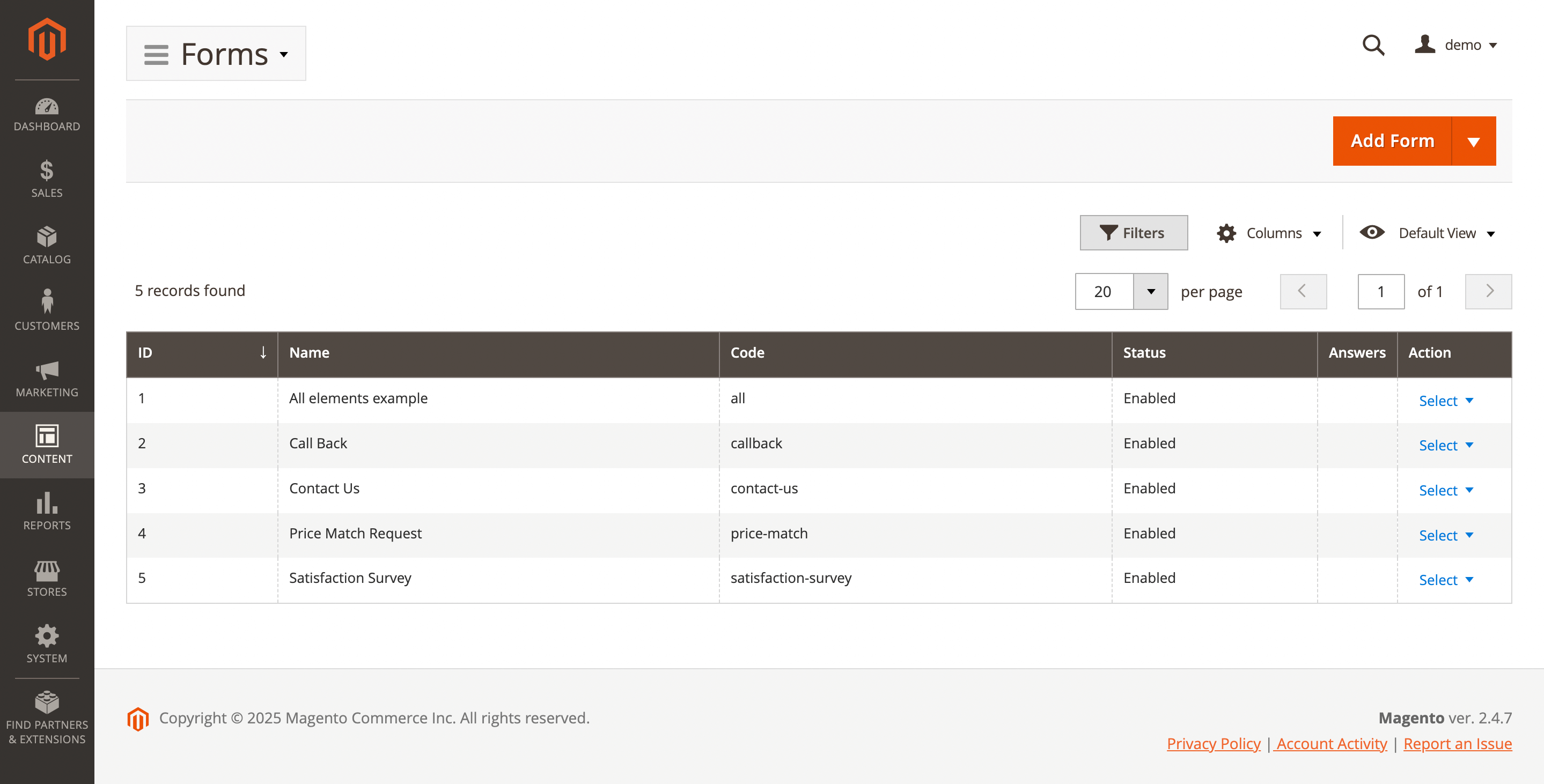
Here, you'll find the following fields:
- ID: ID of the form.
- Name: form name.
- Code: internal code.
- Status: form status.
- Answers: show customer answers.
- Action: actions on the selected prompts in the queue:
- Edit: allow see and edit trigger.
- Export answers to CSV: allow export form answers.
- Delete: allow remove form.
Click Add Form to create a new form or choose a predefined one—Call Back, Contact Us, Price Match Request, or Satisfaction Survey.
Configure form
Go to Actions -> Edit to view or modify the existing form. The following sections and fields are available:
General Information
Use this section to configure the form’s basic options.
- Active: the form's status.
- Internal name: the internal name of the form (for internal use only).
- Store view: the store view(s) where the form is available.
- Customer groups: the customer groups the form applies to.
- Internal note: admin-only notes (internal use only).
- Convert answer to ticket: allows converting an answer into a ticket. Requires the Mirasvit Help Desk extension.
Form builder
Structurally, the form consists of one or more pages. On each page, rows and columns create a grid where customer-visible fields and elements are placed. The form is edited by dragging and dropping elements.
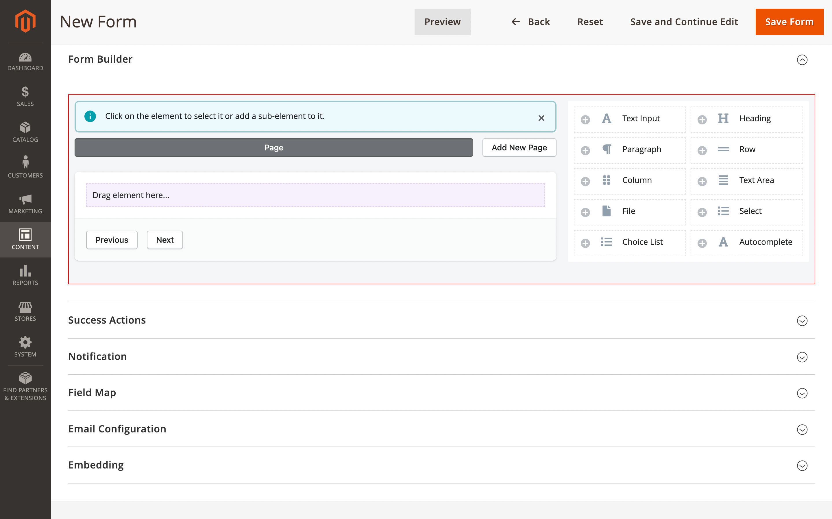
Schematically, the dependencies between form fields can be represented as follows:
Page 1
├── Row 1
│   ├── Column 1
│   │   ├── Heading
│   │   ├── Text input
│   │   ├── Paragraph
│   │   └── ...
│   ├── Column N
│       └── ...
└── Row N

Page N
├── Row N
│   ├── Column N
│   │   └── ...
Each element can have additional settings:
Page
To create new page use Add new page button. To see additional settings choose the Page element in the form and click on edit element button.
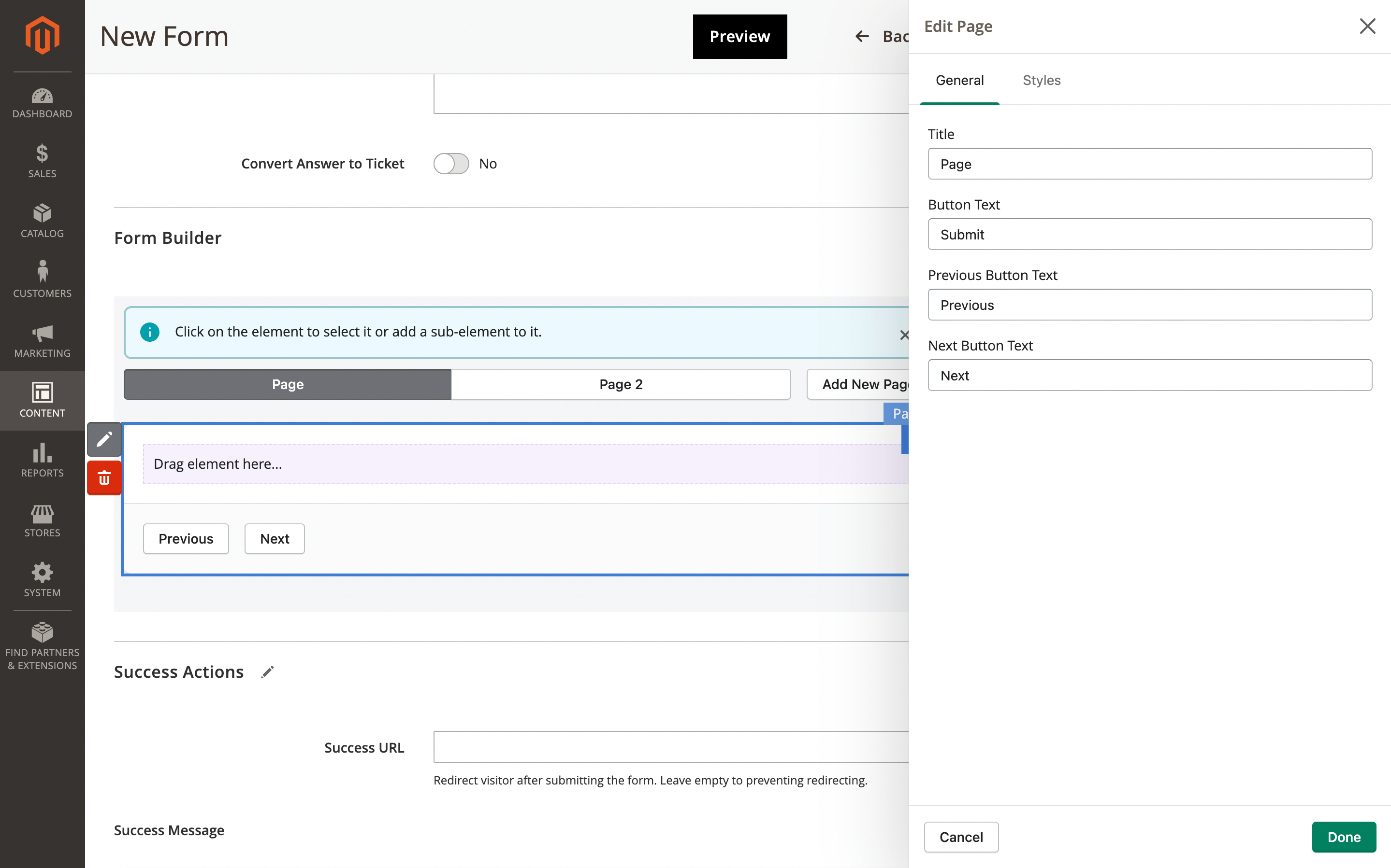
Page additional options
Next settings will be available:
- General
- Styles
- Title: page name.
- Button text: text for submit form button.
- Previous button text: text for previous button.
- Next button text: text for next button.
- CSS class: set own class name for this form page.
Row
To add new row choose page element in the form builder and click on Row element in the side menu.
Additional element settings:
- Styles
- CSS class: set own class name for this form page.
Column
To add new column choose row in the form builder and click on Column element in the side menu.
Additional element settings:
- Styles
- Width: set the column width (1–12).
- CSS class: set own class name for this form page.
Heading
To add new heading choose column in the form builder and click on Heading element in the side menu.
Additional element settings:
- General
- Dependencies
- Styles
- Text: use to set field text.
- Size: use to set header size:
- H1
- H2
- H3
- H4
- H5
- H6
- Add visibility dependencies button: use this to set a field’s dependency on the value of another field in the form.
- #: item number,
- Field: use it to choose available field.
- Value: set value for check.
- Delete button: use to remove item.
- Width: set the column width (1–12).
- CSS class: set own class name for this form page.
Text input
To add new text input field choose column in the form builder and click on Text input element in the side menu.
Additional element settings:
- General
- Advanced
- Dependencies
- Styles
- Label: use to set input text label.
- Required: use to set field as required.
- Placeholder: add placeholder text to the field.
- Help text: add help text near the field. Supports a limited number of tags:
a,span,i,b,strong,em,q,code,mark,abbr,sub,sup. - Identifier: set id for input field.
- Default value button: use to set a default value, or provide a variable to auto-fill the field when the form opens.
- Type: set one of provided field type:
- Text
- Hidden
- Number
- Password
- Search
- Tel
- URL
- Date
- Datetime-local
- Month
- Time
- Week
- Currency
- Input validation: depending on the selected type, validation will be applied when the field is filled in:
- None: disable validation
- Numbers
- Max Length: set the maximum number of characters the customer can enter in the field.
- Add visibility dependencies button: use this to set a field’s dependency on the value of another field in the form.
- #: item number,
- Field: use it to choose available field.
- Value: set value for check.
- Delete button: use to remove item.
- Width: set the column width (1–12).
- CSS class: set own class name for this form page.
Paragraph text
To add new paragraph text choose column in the form builder and click on Paragraph text element in the side menu.
Additional element settings:
- General
- Dependencies
- Styles
- Text: use to set text.
- Add visibility dependencies button: use this to set a field’s dependency on the value of another field in the form.
- #: item number,
- Field: use it to choose available field.
- Value: set value for check.
- Delete button: use to remove item.
- Width: set the column width (1–12).
- CSS class: set own class name for this form page.
Text area
To add new text area choose column in the form builder and click on Text area element in the side menu.
Additional element settings:
- General
- Advanced
- Dependencies
- Styles
- Label: use to set text area label.
- Required: use to set field as required.
- Placeholder: add placeholder text to the field.
- Help text: add help text near the field. Supports a limited number of tags:
a,span,i,b,strong,em,q,code,mark,abbr,sub,sup. - Identifier: set id for input field.
- Default value button: use to set a default value, or provide a variable to auto-fill the field when the form opens.
- Rows: set the number of rows this field uses.
- Max Length: set the maximum number of characters the customer can enter in the field.
- Add visibility dependencies button: use this to set a field’s dependency on the value of another field in the form.
- #: item number.
- Field: use it to choose available field.
- Value: set value for check.
- Delete button: use to remove item.
- Width: set the column width (1–12).
- CSS class: set own class name for this form page.
Select
To add new select dropdown choose column in the form builder and click on Select element in the side menu.
Additional element settings:
- General
- Dependencies
- Styles
- Label: use to set text area label.
- Required: use to set field as required.
- Multiselect: allow customer to choose a few options.
- Help text: add help text near the field. Supports a limited number of tags:
a,span,i,b,strong,em,q,code,mark,abbr,sub,sup. - Add options: button allows you to add multiple options to the select field:
- #: item number,
- Active: use it to use option
- Label: set label description.
- Delete button: use to remove item.
- Identifier: set id for input field.
- Add visibility dependencies button: use this to set a field’s dependency on the value of another field in the form.
- #: item number.
- Field: use it to choose available field.
- Value: set value for check.
- Delete button: use to remove item.
- Width: set the column width (1–12).
- CSS class: set own class name for this form page.
Choice list
To add new choice list choose column in the form builder and click on Choice list element in the side menu.
Additional element settings:
- General
- Dependencies
- Styles
- Label: use to set text area label.
- Required: use to set field as required.
- Allow multi-select: allow customer to choose a few options.
- Horizontal: allow show items in horizontal line.
- Help text: add help text near the field. Supports a limited number of tags:
a,span,i,b,strong,em,q,code,mark,abbr,sub,sup. - Add options: button allows you to add multiple options to the select field:
- #: item number,
- Active: use it to use option
- Label: set label description. Supports a limited number of tags:
a,span,i,b,strong,em,q,code,mark,abbr,sub,sup. - Delete button: use to remove item.
- Identifier: set id for input field.
- Add visibility dependencies button: use this to set a field’s dependency on the value of another field in the form.
- #: item number,
- Field: use it to choose available field.
- Value: set value for check.
- Delete button: use to remove item.
- CSS class: set own class name for this form page.
File
To add possibility attach file to form choose column in the form builder and click on File element in the side menu.
Additional element settings:
- General
- Advanced
- Dependencies
- Styles
- Label: use to set text area label.
- Required: use to set field as required.
- Help text: add help text near the field. Supports a limited number of tags:
a,span,i,b,strong,em,q,code,mark,abbr,sub,sup. - Identifier: set id for input field.
- Extension(s): set the file extensions the customer can upload (
PDF,PNG,JPG, etc.), or use*to allow all files.
- Add visibility dependencies button: use this to set a field’s dependency on the value of another field in the form.
- #: item number.
- Field: use it to choose available field.
- Value: set value for check.
- Delete button: use to remove item.
- CSS class: set own class name for this form page.
Autocomplete
To add possibility automatically fill field from product data choose column in the form builder and click on Autocomplete element in the side menu.
Additional element settings:
- General
- Advanced
- Dependencies
- Styles
- Label: use to set autocomplete field label.
- Required: use to set field as required.
- Placeholder: add placeholder text to the field.
- Help text: add help text near the field. Supports a limited number of tags:
a,span,i,b,strong,em,q,code,mark,abbr,sub,sup. - Identifier: set id for input field.
- Provider: set source where form builder will receive data.
- Product
- Default value button: use to set a default value, or provide a variable to auto-fill the field when the form opens.
- Add visibility dependencies button: use this to set a field’s dependency on the value of another field in the form.
- #: item number.
- Field: use it to choose available field.
- Value: set value for check.
- Delete button: use to remove item.
- Width: set the column width (1–12).
- CSS class: set own class name for this form page.
Success action
Use this to configure the extension’s actions after the form is successfully completed and submitted.
- Success URL: redirect the visitor after submitting the form. Leave empty to prevent redirection.
- Success message: shown this message to the customer once the form is sent. Support variables.
Notification
Use this option to explain to your customers why the form isn’t displayed on the page.
- Notification message: use to set notification message for customers.
Field map
Use these options to also send the answers to the customer.
- Customer email field: allow the customer to receive an email with the form data at the address entered in this field. An
emailinput field must be created first. - Customer email template: сhoose the email template used to send responses to the customer. When Default is selected, the template is chosen according to the theme fallback rules. You can create own email template in the Marketing -> Communications -> Email templates.
Email configuration
Use to configure who will receive customer answers from form.
- Admin emails: specify the particular admin email. Multiple emails is support. Use comma as a separator.
- Admin email template: specify an email template. You can create own email template in the Marketing -> Communications -> Email templates.
- Conditions: allows sending the form to different admin users based on the value entered in a chosen form fields:
- Field name: select one of created form field.
- Value: set value that should be compared.
- Conditions: set one of available conditions:
- Equal
- Less
- Greater
- Less or equal
- Greater or equal
- Email: set target user email.
Embedding
Provides the embed code to insert the form on any store page.
- Form code: unique code to identify form.
- HTML embedding code: use this code to insert the form to CMS Pages (using Page Editor).
- Layout embedding code: use this code to insert the form to layout files (.xml)
- Template embedding code: use this code to insert the form to template files (.phtml).
Use the Preview button to check your form after saving.
Preinstalled forms
To view available preinstalled forms navigate to Content -> Form Builder -> Forms and click on Add form button.
Call back form
Allows customers to request a callback.
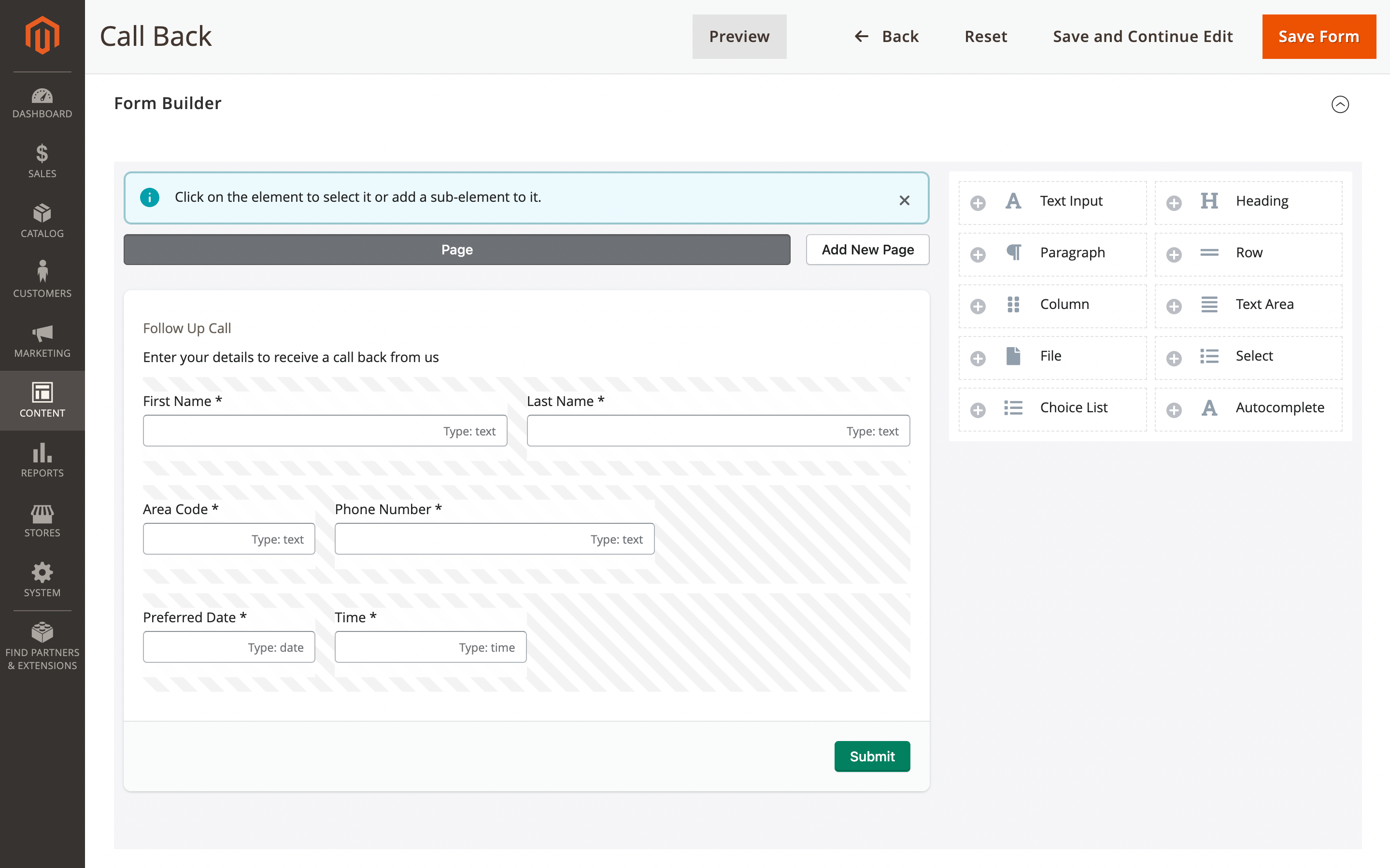
Call back form example
Contact us
Allows customers to contact the administrator, specify a reason, and optionally add a detailed description of the issue or question. The customer's name and email address are auto-filled from variables.
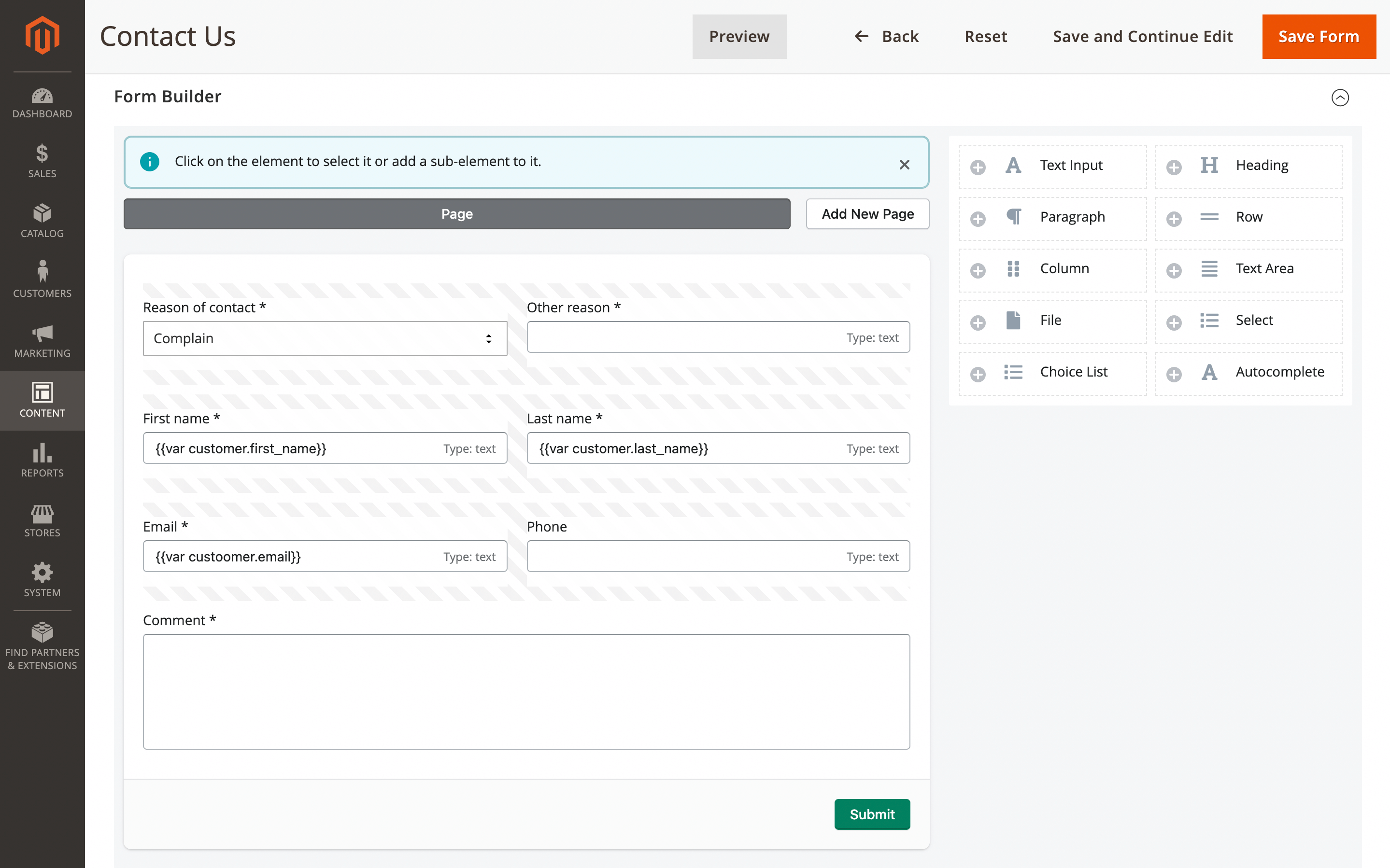
Contact us form example
Price match request
This form appears on the product page and is used to request a price quote.
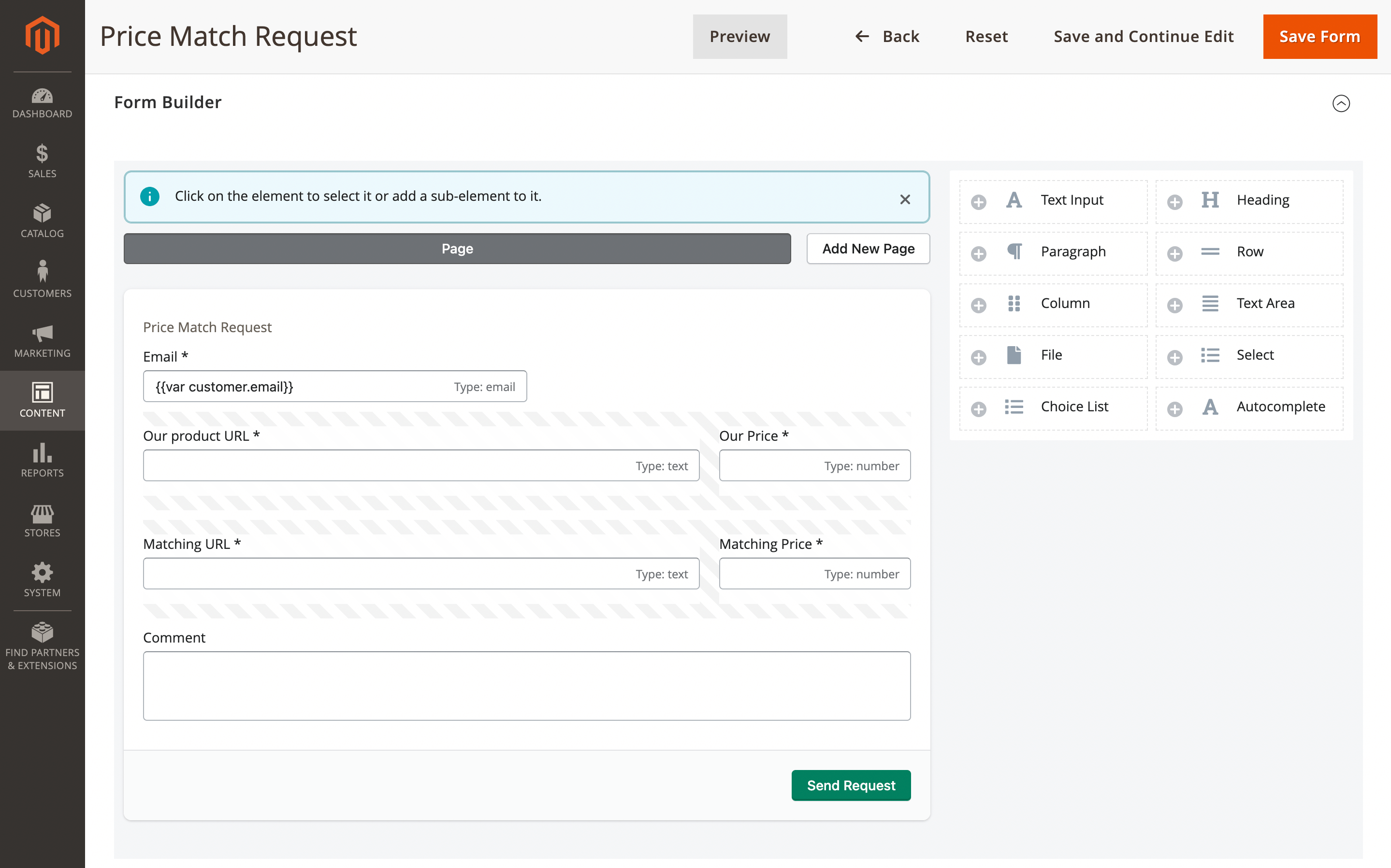
Price match request form example
Satisfaction survey
This form is used to ask customers about their satisfaction with the service to assess the store’s performance.
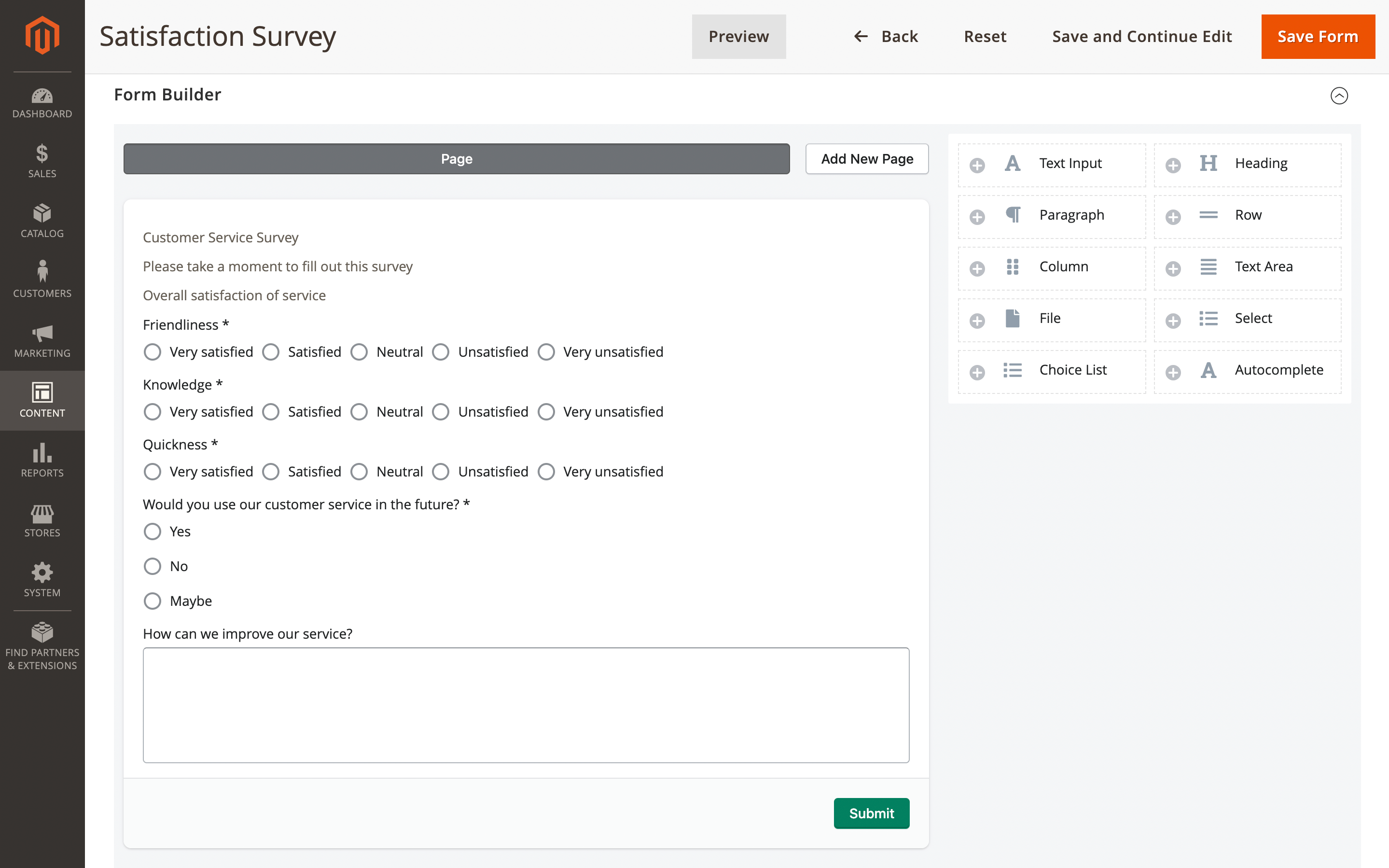
Satisfaction survey form example
All elements example
This form is for testing purposes and to display all available elements.