Layered navigation filters
This section describes the settings for configuring the behavior of filters, their appearance, and SEO settings.
You can find it in the Stores -> Configuration -> Layered navigation filters section.
To apply the settings, clear the Magento cache after making any changes to the options below
General settings
-
Enable AJAX filtering: enables AJAX for filters. When active, only filter-dependent data is loaded from the server, while the rest of the page content remains static.
-
Filters application mode: defines how filters are applied:
- Instantly: filter starts its work immediately after the option is selected.
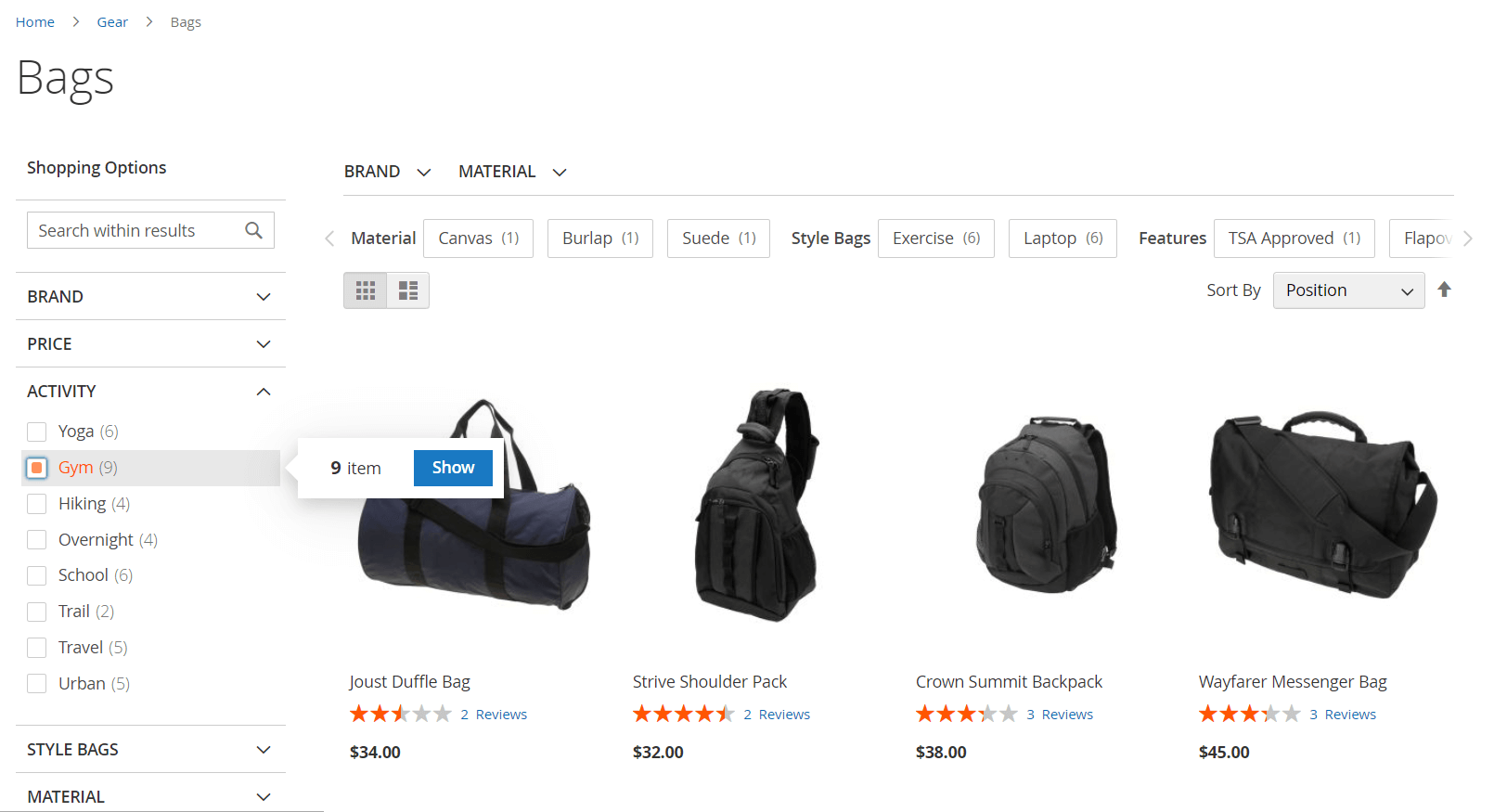
- By button click: adds confirmation window that appears when you choose a filter option.

Confirmation window with button -
Options counts precalculation: dynamically calculates the number of possible results for combinations with other filters when the current filter option is selected but not yet confirmed. Appears if Filters application mode is By button click.
-
Scroll behavior after filtering: defines where the page should scroll after applying a filter:
- Disabled: the page will not scroll after selecting a filter.
- Scroll to page top: after selecting a filter value, the page will scroll to the top.
- Stay on last selected filter: the page will not scroll and stay near selected option. Applicable for filters in multiselect mode and only in instant AJAX mode. Otherwise, it uses the Scroll to page top behavior. For horizontal filters, the behavior is also Scroll to page top.
-
Enable multiselect: allows selecting multiple options in a filter for combining several filtering requests.
noteIf disabled, it may be overridden by active Enable multiselect option in an attribute edit menu. Refer to Additional section.
-
Sticky sidebar: keeps the sidebar with filters in a fixed position while scrolling the page.
-
Screen width breakpoint (px): defines breakpoint width between mobile and desktop layouts. 768 pixels is the default value. Appears if Instantly is selected in Filters application mode.
Mobile settings
This subsection appears if Instantly is chosen in Filters application mode configuration.
- Apply filters by Button click on mobile: overrides the instantly filter application mode, requiring mobile users to tap a confirmation button to apply filters.
Appearance settings
Filter appearance
-
Filter selection display style: defines how each filter option appears:
- Default (link): no additional selection mark is shown. Options are shown as links.
- Simple checkbox: checkbox without possibility of visual customization.
- Checkbox: checkbox that can be customized.
- Circle: circle that can be customized.
-
Show expanded filters by default: displays filters as expanded when category pages are opened.
-
Limit for default expanded filters: number of filters expanded by default. Leave empty to expand all filters.
noteThe count starts from the top filter in the category; you can't specify which exact filters will be expanded.
-
Hide inactive filter options: hides filter options with no available products to display.
-
Show clear options button: displays a clear button with the number of the selected options within the filter.
-
Selection background color: background color for selected checkboxes or circles.
-
Selection border color: border color for selected checkboxes or circles.
-
Selection mark color: color for the selection mark (checkmark).
Filter options appearance
-
Limit the number of displayed filter options: defines whether and how filter options are limited:
- Scroll box: displays a scroll box that contains a number of options based on the Height of scroll box (px) configuration.
- Show/hide link: allows users to expand or collapse filter options using a button.
- Disabled (no limits): always show all filter options.
-
Height of scroll box (px): height of the scroll box. Appears when Scroll box is chosen.
tipThe height of the scroll box is approximately equal to the number of filter options multiplied by 33 pixels.
-
Maximum number of visible filter options: number of filter options displayed before showing the button. Appears when Show/hide link is chosen.
-
Show alphabetical index if filter options exceed: displays an alphabetical index if the number of filter options exceeds this limit. Leave empty to always show the alphabetical index.
-
Label for "Show less": custom text for the Show less button when hiding excess filter options. Appears when Show/hide link is chosen.
-
Label for "Show more": custom text for the Show more button when displaying additional filter options. Appears when Show/hide link is chosen.
Link highlighting
- Enable link highlighting: highlights active links (chosen options) in filters.
- Highlight color: color for highlighting active links. Appears when Yes selected previously.
- Custom CSS: this field allows adding additional CSS for custom styling of filter highlighting.
Price slider styling
Configurations for the slider type of price filter.
- Primary slider color: color for the the active range of the filter.
- Secondary slider color: color for the slider track.
Additional filters
Extension adds additional filters based on dynamic attribute values (such as on sale or rating), by matching text search requests, or belonging to a specific category.
Category filters
- Enable category filtering: adds a filter with categories as options. Shows products related to a corresponding category.
- Category filter mode: defines the format of the URL link when the category filter is applied (only on category pages):
- Filtered links (default behaviour): shows applied filter as a part of the request, for example,
?category_ids=14. - Category navigation links: shows applied filter as a direct link to subcategory, for example,
/tops-men/jackets-men.html.
- Filtered links (default behaviour): shows applied filter as a part of the request, for example,
- Show nested categories: displays subcategories within the main categories.
- Collapsible subcategories: allows subcategories to be collapsible for a cleaner layout. Appears when Yes is selected in the Show nested categories.
- Sort options by: allows to order filter options by Position, Label (alphabetically) or by Product Count. Appears when No is selected in the Show nested categories option.
- Use alphabetical index: adds an alphabetical index to the filter. Shows the first letter of filter options names and allows filtering options by them.
Product status filters
- New products filter
- Sale filter
- Stock availability filter
- Rating filter
New products filter: filter to show only new products.
- Enabled: Yes displays the filter.
- Label: custom name for this filter.
Newis the default value. - Position: position of the filter in the sidebar. 100 is the default value.
Sale filter: filter to show products on sale.
- Enabled: Yes displays the filter.
- Label: custom name for this filter.
Saleis the default value. - Position: position of the filter in the sidebar. 100 is the default value.
Stock availability filter: filter for in-stock or out-of-stock products.
- Enabled: Yes displays the filter.
- Label: custom name for this filter.
Stockis the default value. - In stock filter label: custom name for the in stock option.
In Stockis the default value. - Out of stock filter label: custom name for the out of stock option.
Out of Stockis the default value. - Position: position of the filter in the sidebar. 100 is the default value.
Rating filter: adds a rating-based filter for product sorting.
- Enabled: Yes displays the filter.
- Label: custom name for this filter.
Ratingis the default value. - Position: position of the filter in the sidebar. 100 is the default value.
Search filter
- Enabled: Yes displays the filter. Allows searching within the results on the current page using text requests.
- Label for search: text that displayed in the empty search bar.
- Enable fulltext search: activates full-text search within the category page.
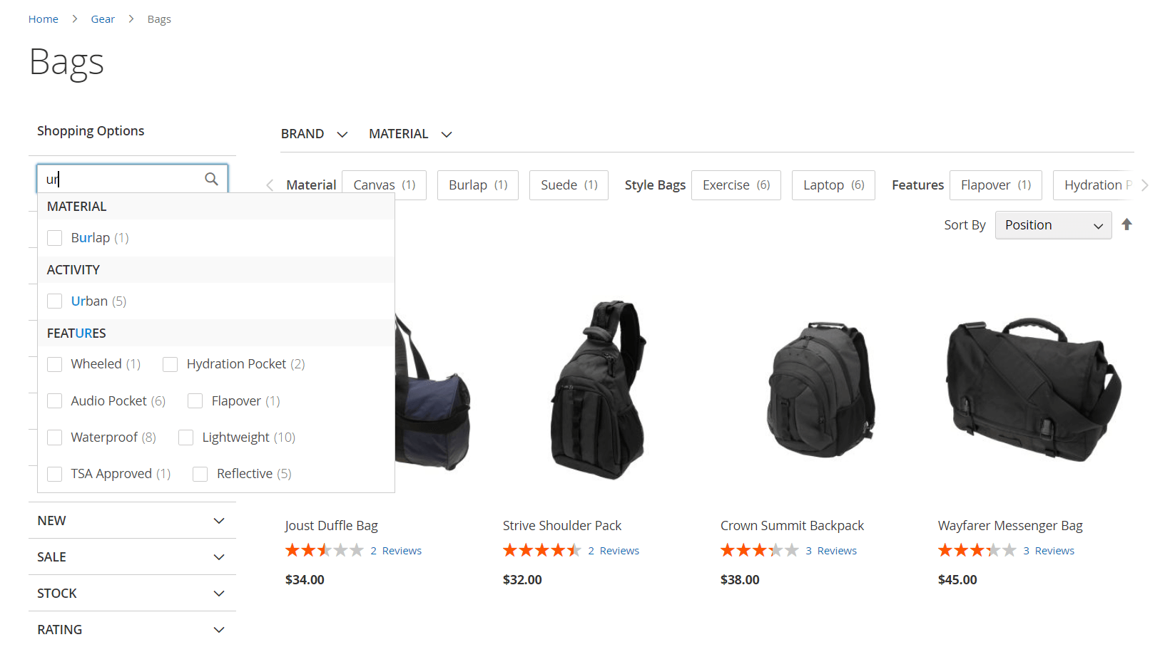
- Search by attribute options: displays dynamic pop-up with attributes and options matching the search query.

Horizontal filters
Filter display for horizontal panels
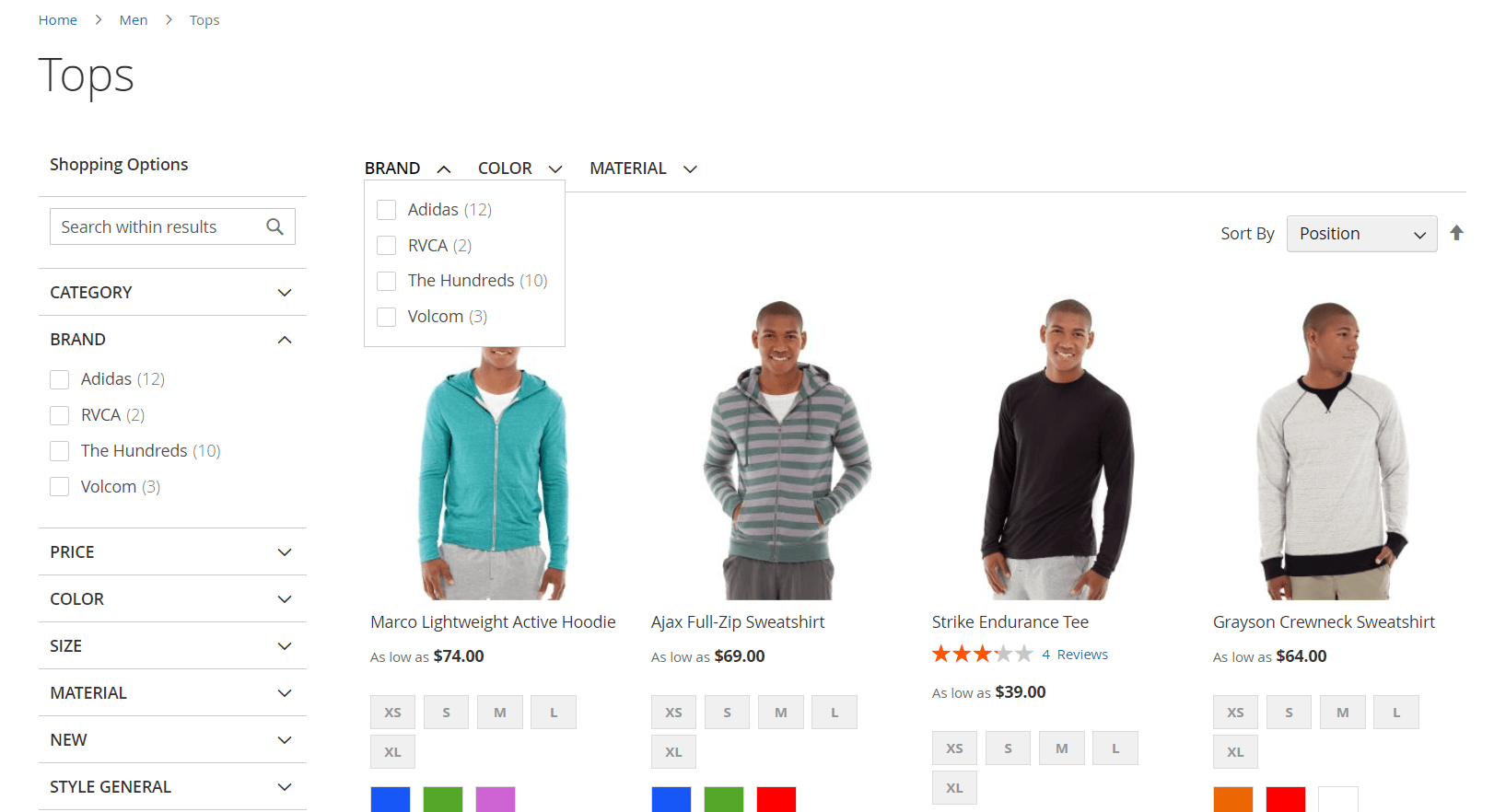
- Select attributes for horizontal display: filters to be displayed in the horizontal filter panel:
- Sidebar (default): usual place of filters (for default Magento it is left column).
- Horizontal: filter is shown only in the horizontal bar.
- Sidebar & Horizontal: filter is shown both in the horizontal bar and in the sidebar.

Filters displaying when Sidebar & Horizontal option is selected - Hide horizontal filters on small screens: hides horizontal filters on screens smaller than the specified width in pixels. This configuration is useful for hiding horizontal filters when browsing categories on mobile devices.
Clear filter block
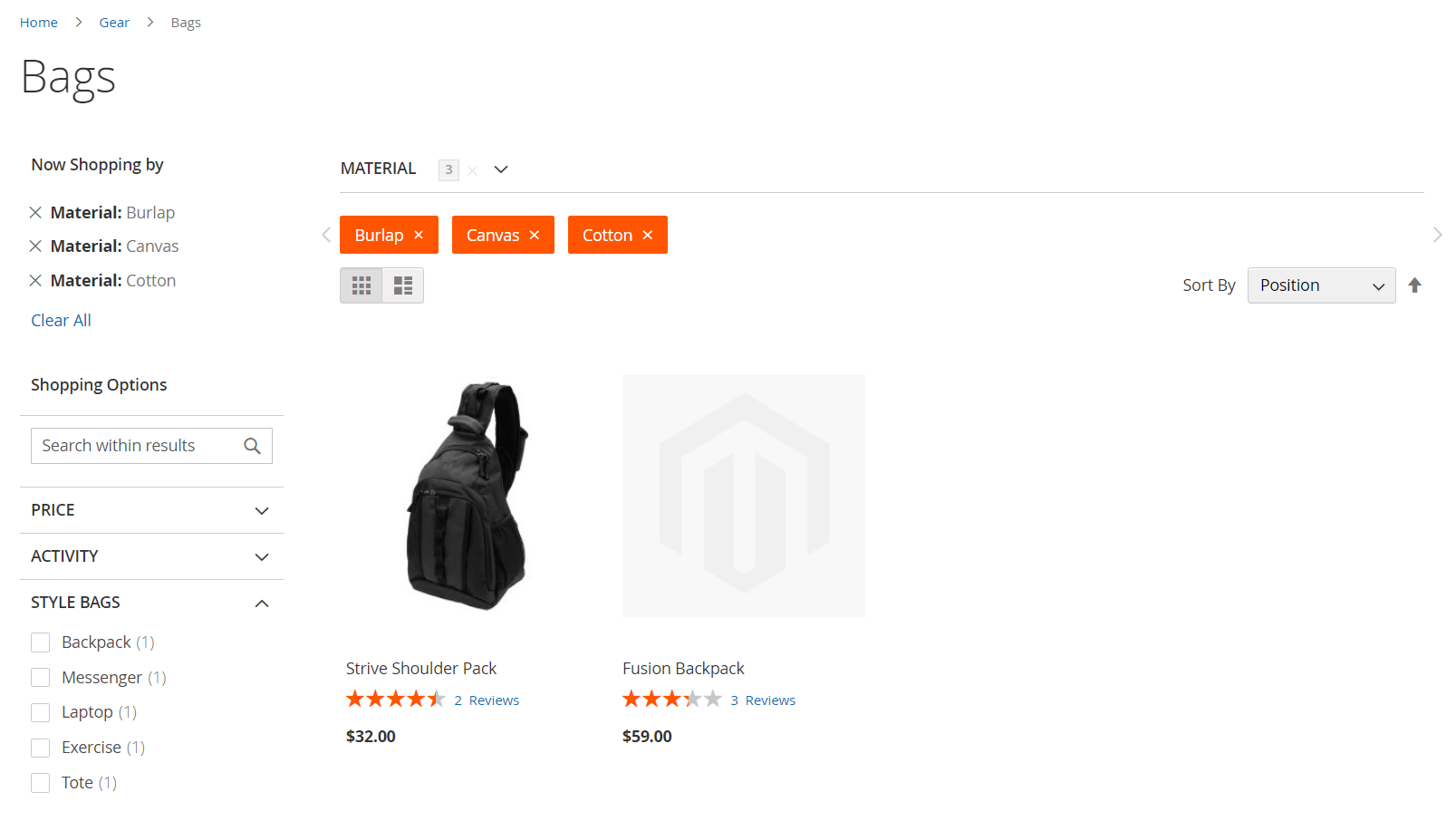
This block is used to display the filters already applied and provides the ability to discard them individually.
- Clear filter position: position of the filter clear button:
- Sidebar: displays the clear block in the filters column.
- Header: displays the clear block above the horizontal filters.
- Hidden: hides the clear block entirely.
- Group selected options by attribute: groups selected filter options under the related filter name:
- Color: Red, Blue
- Color: Red, Color: Blue

SEO settings
SEO configuration
We recommend consulting with your SEO specialist to determine the most effective solution.
- Meta header for filtered pages: defines meta header behavior for filtered pages:
- Don’t change: don't overwrite already configured meta headers.
- NOINDEX, NOFOLLOW
- NOINDEX, FOLLOW
- INDEX, NOFOLLOW
- INDEX, FOLLOW
- Canonical links for filtered pages: sets the canonical link format for filtered pages:
- Don’t change: don't overwrite already configured canonicals.
- Current URL: displays a canonical as the URL including the applied requests and filters.
- URL without applied filters and GET parameters: canonical includes only a path to the current category.
- Current URL without GET parameters: canonical includes applied filters without GET requests.
- Rel attribute for filter links: defines
relattribute for filter links (e.g., follow/nofollow). Follow (rel="follow") allows crawlers to follow the filter links. - Active filters nofollow threshold: defines the number of applied filters after which filter links will have the attribute rel=nofollow. Empty field applies
relattribute to all filter links based on Rel attribute for filter links setting.
Product attribute links
Dynamic links for product attributes
This feature turns product attributes on the product page to clickable filter links. If attributes are available for filtering, they will be displayed as active links. Clicking on these links leads to a page showing filtered results based on the selected attribute.
- Enable dynamic attribute links on the product page: creates clickable filter links for product attributes on the product page.
Attributes are represented as active links - Target: defines how the page filtered by attribute will open:
- _self: displays the filtered results on the current page by reloading it.
- _blank: opens the filtered results in a new browser tab.
- Attributes: dropdown list with attributes. Selected attributes become product attribute links.
- Integrate with brands: enables transition to corresponding brand pages whenever click a brand link.