Widget editor
To configure the widget press the gear icon in the right top corner of the widget. The Widget Editor will appear.
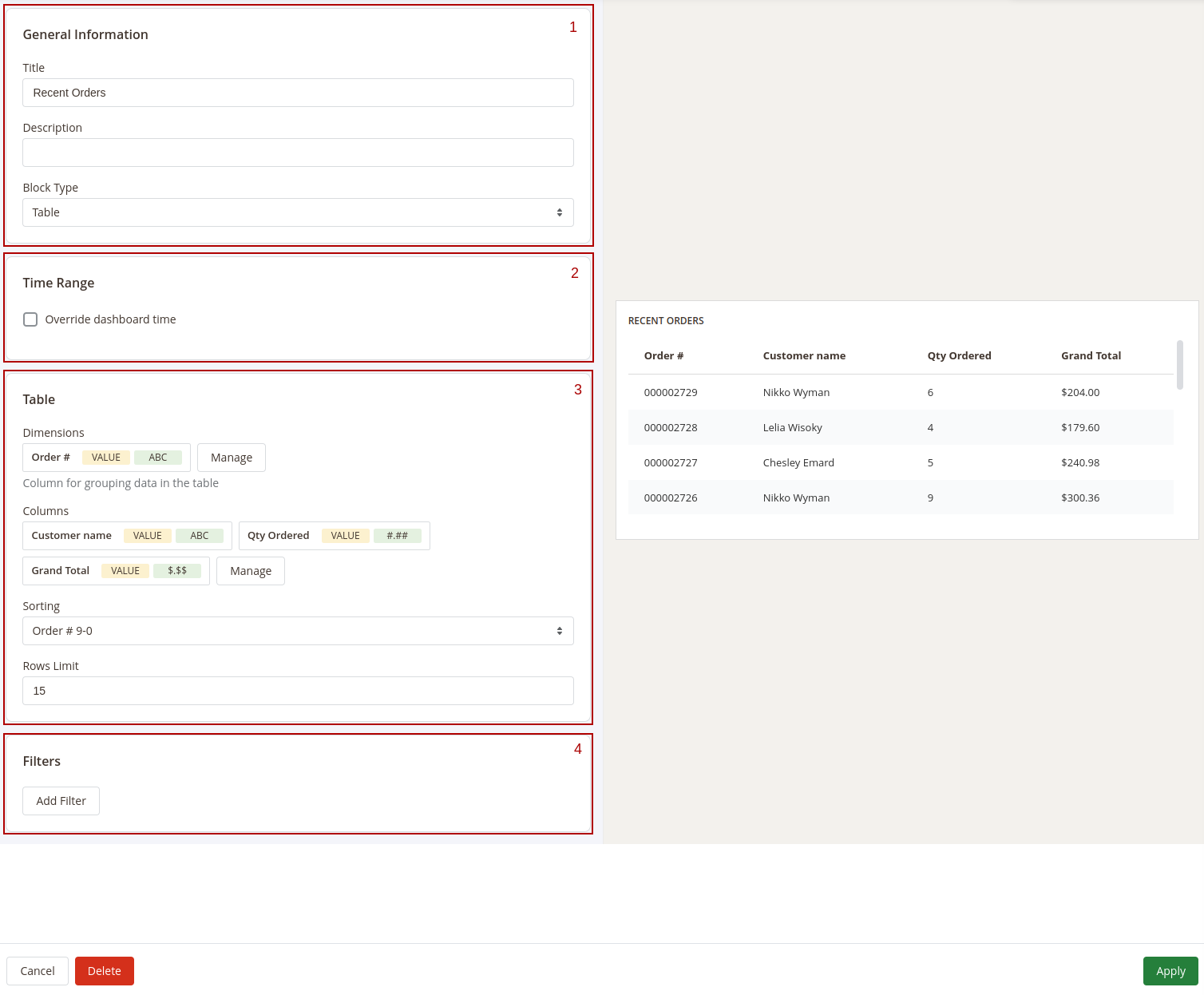
The Widget Editor has 2 sections - Widget Settings to configure the widget and Preview to check how the data in the widget will be displayed before saving the widget. The Widget Settings section has the following inner sections:
1. General information
Main configurations of the widget. This section has the following settings:
- Title: the name of the widget
- Description: widget's description
- Type: defines how the data in the widget should be displayed.
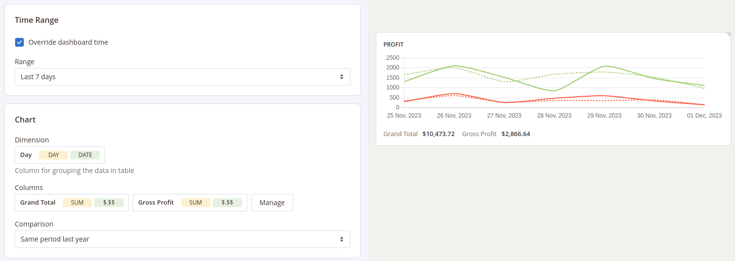
2. Time Range
Date filter settings for the widget. This section has only one setting - Override dashboard time. When this setting is enabled the widget will use its own date range to filter the data. You'll be able to choose one of predefined date ranges from the Range dropdown.
3. Widget's content settings
This section depends on the Type of the widget and has different setting options correspondingly:
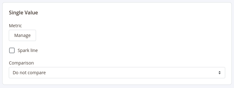
Single Value
Shows a single value in the widget, optionally with a goal gauge.
This type has the following settings:
- Metric: choose the column for which the data in the widget should be displayed
- Spark Line: show/hide the sparkline representing changes of the value from the column selected in the Metric setting during the time range applicable for current widget
- Comparison: choose the period for which the widget should display the value for the same metric to compare it with the current value. The change versus that period is shown under the value and is coloured by the Goal direction — a rise is green for higher is better metrics and red for lower is better ones.
- Goal type: where the goal's target comes from — Fixed value (you enter the target yourself) or Compare to period (the target is taken from the period chosen in Comparison, so the gauge tracks the current value against the previous one).
- Goal direction: which way is good, and how the gauge fills — Higher is better (the gauge fills from
0up to the target; reaching or exceeding it is good, e.g. orders or revenue) or Lower is better (the goal is0and the gauge fills as the value drops toward it; lower is good, e.g. refunds, returns, or open tickets). - Goal / target: shown for a fixed, higher is better goal — the value that represents
100%of the goal. Leave it empty to show a plain value with no gauge. - Baseline (worst case): shown for a fixed, lower is better goal — the value at which the metric is fully bad (
0%on the gauge). The goal is always0, and the gauge fills as the value drops toward it. Leave it empty to show a plain value with no gauge. - Goal style: how the goal is drawn once it is configured — Ring gauge, Half gauge, or Progress bar.
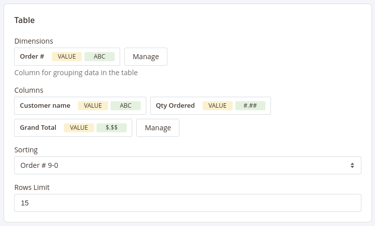
Table
Displays the table with values according to the configurations (similar to how the reports are displayed)
This type has 5 settings similar to settings in reports configurations:
- Base Table: set the base table for the table
- Dimensions: set the dimensions for the table
- Columns: select fields that should be displayed in the report
- Sorting: select the column for the report to be sorted by and the sorting direction. Options depend on the fields selected in the Dimensions and Columns settings
- Rows Limit: set the limit for the number of rows to be displayed in the table
Chart
Displays the data in the widget as a chart
This type has the following settings:
- Dimension: defines the horizontal axe in the chart
- Columns: defines the fields data that should be used in the chart
- Chart type: how the series are drawn — Line, Area (a filled line), Bar (grouped bars when several columns are selected), or Stacked bar (the selected columns stacked into a single bar).
- Comparison: defines the period in which the current data in the chart should be compared
HTML
Enables you to include any content on the dashboard
This type has has only one field to fill in - Content.

4. Filters
Configure fields and conditions by which the data in the widget should be filtered. Similar to the Filters settings in reports configurations.
After configuring the widget press the Apply button to apply the widget settings' changes.
After adding and configuring all widgets to the board press the Save Board button in the Toolbar and click the Customize button to exit the Configure mode.